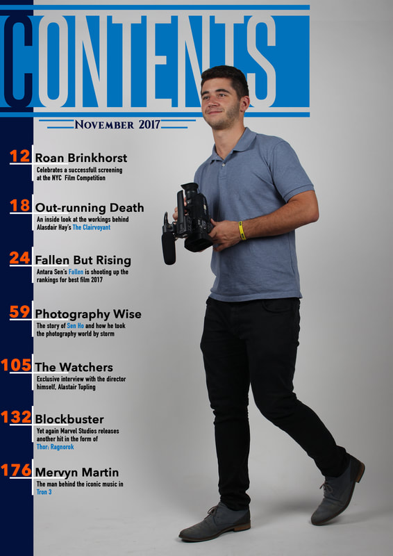
TitleOther than the primary image, the title needs to be the biggest item on the page and needs to clearly stand out. This is done not only by making it the biggest item but also by changing color. I experimented with different variations of the title combining the previously established color scheme. In the end I settled on the white with blue. I chose this one as it fit very well with the image, due to the color of his shirt and the blue being very similar. However, like the light blue variant, the white is very bright and some lines get a bit lost against the light background of the image. The other option I considered most was the orange with black, this is because it stands out very clearly on the page due to how the black enhances the orange, however the primary color of this theme is blue and having such a large title not be using the primary color would be unconventional. ContentsWhen creating the contents I decided to create a form of bookmark / tab similar to ones use on the final front cover however, in order to make it more unconventional i brought back the semi transparent shapes. These light shapes allowed the solid colored text to stand out more. The titles of each article were made blue in order to match the title whilst the combination of orange for main body of text and white for any keywords were used to describe the article.
The above photos show the difference made by using white to highlight the keywords. The white emphasizes the keywords and draws the eye, which allows readers to clearly identify what it is they want to read. Due to the unique shape created by the guy in the image, it provides an opportunity to explore using him in order to affect the angle/direction of the contents tabs.  The tab was framed quite well and I achieved the effect I wanted, but at the cost of needing shorter titles and slightly longer descriptions After creating the upside down tab, I had the idea of taking the tab / bookmark shape farther by alternating each tab. This would create a "V" shape between each tab. In order to do this I duplicated and edited the "Roan Brinkhorst" tab and flipped the shape and tweaked the text in the "Clairvoyant" tab, this is the outcome I had:  This effect was quite successful in keeping a constant style throughout the page. However it left and awkwardly sized space which could not be filled by one tab unless it was bigger than the rest but i would then be inconsistent, the same issue would occur if two smaller tabs were used as well. Another key issue was I did not create a suitable space in which same sized numbers could be placed. DateIn order to convey a sense of officialism i used serif font as it is more sophisticated and refined than the sans serif used on the rest of the page. The date is a small aspect that must be kept subtle while still being readable, this is done by the use of color in which i chose between black and white because they both blended in with the rest of the page (in different ways) and were readable against the light colored background.
As you could have seen in the final contents photo, i chose to use black, this is because the black is a lot easier to read when compared to the white while still being able to blend into the page due to the darker blues used in the title and the heading in the contents.
0 Comments
|


