Integration Logo
Due to the futuristic elements of the short film as well as the animated icons I created earlier in Adobe After Effects the colors that I have to my disposal are following:
|
Dark Blue / Light Blue: These two blues were previously used in the HW logo for the AR H.U.D. These colors were previously used due to the futuristic tone that they are able to connote. This is done by conveying a sense of purity and clarity of the future and its possibilities.
White: Similarly to the blues, White conveys similar messages of purity and hope in anticipation for a brighter future. On top of this, white is also one of my school's key colors which is often used as a tertiary color to sports uniforms, whereas at events it is a primary color. Red / Green: These 2 colors are iconic to the Alice Smith School and frequently used through the school's advertising and uniform. Once I established which colors would function in the logo / title of the film, I would be able to carry these colors forward however, I would first need to find a suitable font. |

|

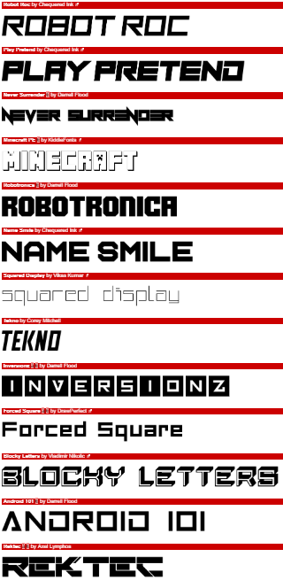
In order to find a fitting font, I used the website Dafont.com to find a suitable font. Using the variety of filters, I searched for a "Techno - Square" font. These were futuristic sans-serif fonts (examples can be seen on the right) From this list, I shortlisted 4 different fonts that I believed to be suitable for my short film:
|
|

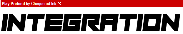

In the end, I decided to follow through with font 3 (Tekno by Corey Mitchell) as it was the one font that although bold, was not imposing and was style able to be stylized without making it harder to read.
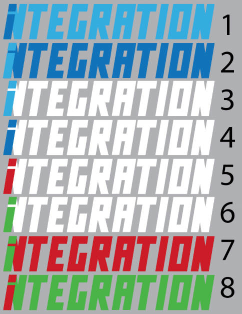
Once I had established which font I would be using I was able to move forward and create draft logos that experimented with color. I created 8 variations using the colors I selected earlier:
|
In order to decide which color combination I would use, I created another google form to be answered by a small selection of my target audience:
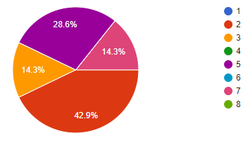
Audience Responses:
"The colors in number 2 are closely associated with 'technology' and I think they will suit your concept of virtual reality" "I find it to be the most aesthetic design" "7 & 8 are KLASS colors and I chose number 2 because of its striking contrast. The colors are also linked to depression/feeling blue which link s somewhat with your story line about isolation as a result of a VR learning experience" The third response in particular is very accurate and explains well part of my reasoning as to why blue is being used. The first response was also able to easily see the connection between blue and technology. Other responses also said how instead of showing the school colors, it felt more Christmas themed over anything else. |
Final Logo:

|
In order to further emphasis the theme of being "In" which was initially creating by the "I" being inside of the "N", I shrunk the "I" slightly so that it would be clearer as before it seemed to be on top of the "N" instead.
I also added a slight drop shadow that helps exaggerate the semi-italic text a little further. Giving it a further dynamic that allows it to stand out clearly as a logo should. |
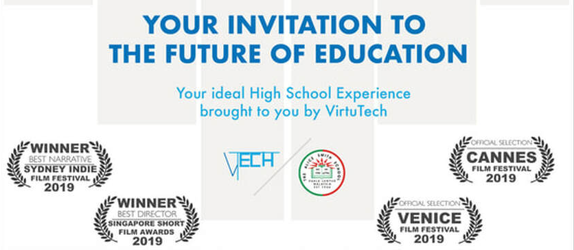
Front of Postcard
|
|
I began by using the shape tool in order to create gray squares of varying width and height, that fine to a point in the center. I lowered the opacity of the shapes in order to more correctly reflect the design I previously created on Wix. I made sure to leave a thin gap in order to suggest a border without clearly defining one. This allows for a clear design without having a dark or thick border which can be seen as imposing.
Next, I added the title I created in the previous section. I enlarged it so that the drop shadow of the I / N and the top corner of the final N would reach the same border defined by the gray shapes. I used the ruler function on Photoshop to made sure that none of the shapes went over the border. I began adding text, starting with “Your Invitation to the future of education” to create a similar effect to that of the website. By inviting the recipient to part of our audience and be immersed in this world. I changed the font to ‘Futura’ medium. This font is very clear and due to being sans-serif, it can be seen as quite similar to the ‘Tekno’ font. I did not use ‘Tekno’ as I wanted this font to be unique to the title. |
I also added a smaller piece of text (also in ‘Futura’) in light blue saying “ Your ideal high school experience brought to you by VirtuTech” this is the first mention of the company that created the virtual reality experience for the Alice Smith School. I decided on the name VirtuTech as it is very simple and can clearly suggest what their purpose of creating virtual reality technology, because of the combination of “Virtu” from “Virtual” and a shortened version of “Technology” - “Tech”.

I created a simple VirtuTech logo by using the line tool to create lines of 2 thicknesses and using the same colors of the integration logo. The Alice Smith School logo, I could simply take the png image I created when I had to add the logo the film’s website. In order to show the relationship that VirtuTech and the Alice Smith School have, I placed the two side by side only separated by a thin gray line. This suggests that there is a collaboration between the two organisations. I placed “VTech” first as it is the larger organisation which is lending it’s aid to this school by providing it the new environment. At this point the logo fit naturally in the bottom right corner as it wouldn’t disrupt the main focus of the postcard which is to invite the viewer. |
|

As part of subtly reinforcing that this is a short film, I integrated the banner that I had previously created in Wix, to be at the foot of the postcard. To create this I used a combination of blue and white rectangles (created with the shape tool). Using the snap to grid option, I was able to line the text up with the center of the page and then elongate the white rectangles accordingly to create a clean fit to frame the text. However, this cause me to move the pair of "VTech" and "Alice Smith School" logos.
After moving the pair of logos, I then had to incorporate the short film festival awards (to see creation of these awards, please click the button below) onto the front, as it is a typical convention I found in several examples. In order to fit all elements on the page, I only had 4 awards (two winners, two official selection to show a balance of winning and being recognized) which i placed in the white spaces that were left opposing the gray squares I previously drew. This allowed me to move the pair of logos into the center, which draws attention to the importance of their collaboration in the short film. I also lowered the opacity of the short film awards slightly so that the dark gray wouldn't stand out too prominently on the page.
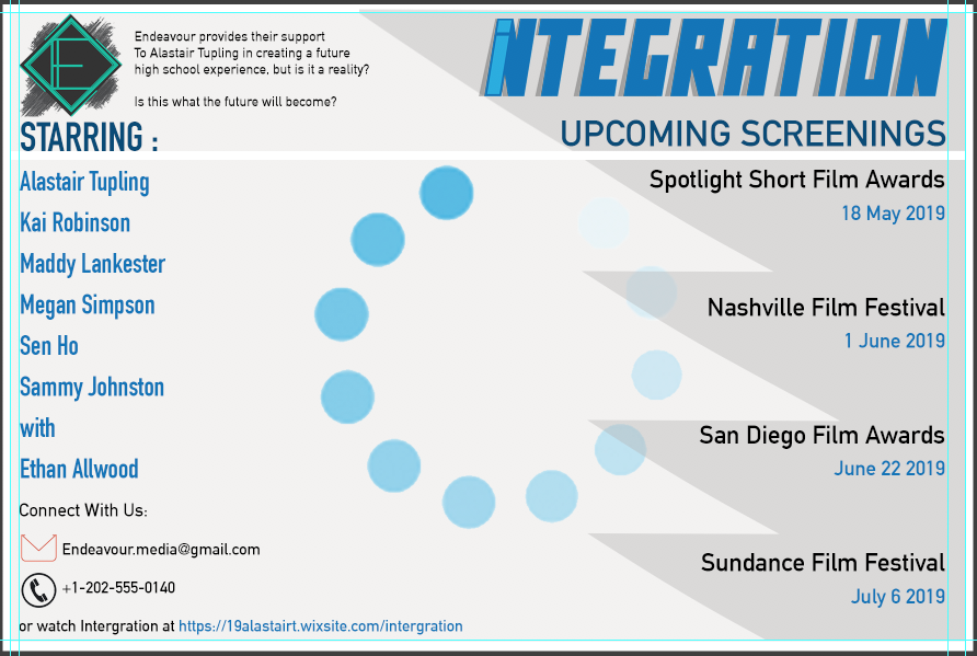
Back of Postcard
The front of the postcard contains the image and minimal text with the intention to draw the receiver in. The back on the other hand aims to provide them with all necessary information such as: Production company, cast. Screening times at short film festivals, contact information etc.

|
In order to not draw too much attention from other information that will go on the page, I made the “Integration” logo smaller and placed it in the top right corner. This way it would still be a prominent part of the back but not dominating the page (unlike on the front).
|
|

|
The next aspect was the “Upcoming Screenings” which I could use techniques i learned in component 1 (AS Media). By using varying font sizes as well as color I am able to create contrast to highlight certain pieces of information. In this case the location being more prominent, that way people can see which locations are more suitable for them, then pay more attention to the dates. I only included 4 screening times as I did not want to overload one side of the postcard with too much information.
In order to fill the space of the back as well as more clearly define key information (Upcoming screenings) I used the shape tool to create a series of triangles that are somewhat reflective of the italics in the integration logo. The highest triangle belongs to Spotlight Short Film Awards, for this triangle I continued the line it created in order to frame the Integration logo, as without this continuation there would be an awkward break on the right side of the postcard back. |

|

When adding the contact information, there was only one remaining corner (bottom left). In regards to the phone icon, I had to find a png online whereas the mail logo was taken from the short film itself, I simply edited it and removed the green ellipse. After this it was simply a matter of using the same font I used for the endeavour statement to add in the contact information. In order to highlight key information (the website) I changed the color of the text to blue so that it can stand out amongst other information in this corner.
|
In order to fill the space on the left side of the postcard I included the short cast list. This is commonly done especially because short films tend to have a very minimal cast. In this case, I had 7 actors (including myself). To prevent the cast list from intruding too far into the center of the postcard, I used a condensed font “DIN Condensed” in which the letter are thinner and there is less space between them (Image 1). Then I changed the size of the text from 18 pt > 12 pt this left a reasonable distance between the bottom of the list and the contact information (Image 2). With this space I could increase the line spacing to fill the space (Image 3).
|
|
|

|
Due to the empty space in the middle, I decided to add an aspect from the short film. For this I used a frozen moment of the loading circle in which a majority of the circles can be seen. I removed the white background (from when it was in the video) and lowered the opacity to 73%. Finally I rotated the loading circle slightly to make the clearest circle at the peak of the circle, This resulted in the creation of my final postcard advert:
Final Postcard Advert

Dark Gray is not the postcard, it's a border to allow you to see the white page clearer.
