Header
At the top of the website lies the header, a central point of navigation for the website, the Header. Within the header is the title of the film I included 4 buttons:
About - Which is a button that is connected to an anchor point at the bottom of the page that will lead you to the synopsis and film awards.
Integration - A button that takes you to a separate page that consists of only the short film
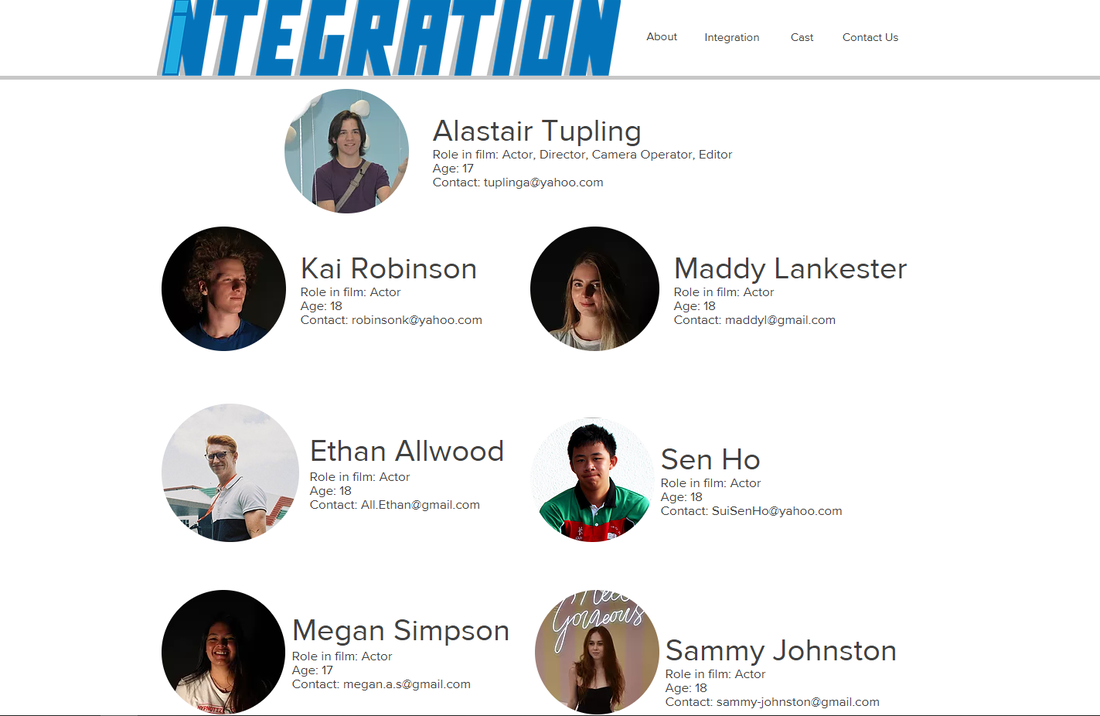
Cast - This button leads you to a page with the ages of the actors as well as contact information.
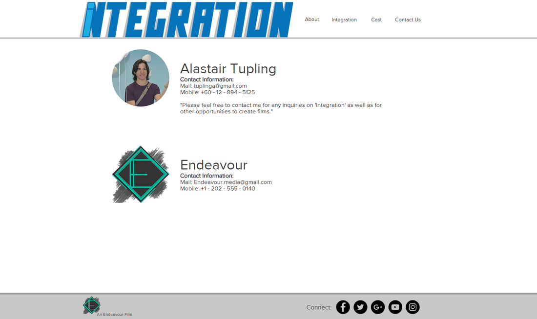
Contact Us - This button takes you to a page including information on the production company as well as contact information / social media of them. The contact information of the director is also available on this page.
About - Which is a button that is connected to an anchor point at the bottom of the page that will lead you to the synopsis and film awards.
Integration - A button that takes you to a separate page that consists of only the short film
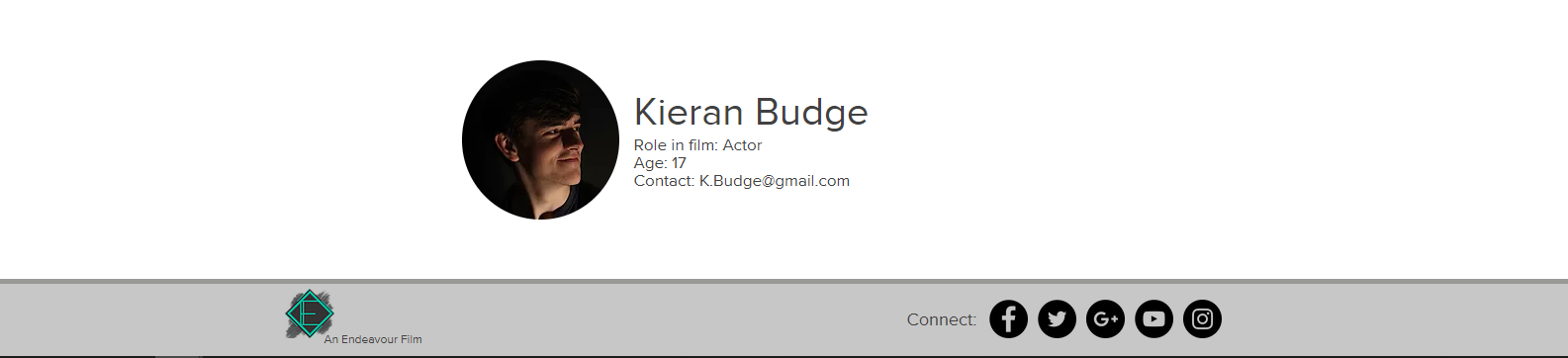
Cast - This button leads you to a page with the ages of the actors as well as contact information.
Contact Us - This button takes you to a page including information on the production company as well as contact information / social media of them. The contact information of the director is also available on this page.

Homepage
Whilst coming up the ideas for the homepage of the film's website I grouped my ideas into 2 different categories:
1 - Short Film Website
Creating a short film website in my eyes could be done with 2 themes. Firstly, the website could be themed as though you are a part of the story itself, in the case of my short film this idea would be possible as the website's main image could be themed similarly to a school's homepage as an invitation to join. Secondly, the website could be themed as a purely place purely to show off and display the information of the film whilst keeping some design aspects in line with the direction of the film (e.g. colors, fonts, shapes, images etc.)
2 - Production Company Website (With page about Short Film)
On the other hand it would be possible to create a website that belongs to the production company. I have found in several cases that smaller short films do not have their own dedicated website, instead they are displayed on a page within either the production company's website or the director's own website. This would be possible and would require further development on the production company and allow me to explore a different theme than that of the short film.
Due to the plot and setting of the short film, I believe that taking the more unconventional idea of creating the website as though the viewer is part of the world will be most effective. The theme that I would like to reinforce is the immersion of the virtual reality experience and creating the website in such a way would allow the audience to be pulled into the world and feel more connected to the world of future possibilities.
The layout I decided to go forward with was that of the school's homepage which is acting as an invitation to come to the school:
The layout I decided to go forward with was that of the school's homepage which is acting as an invitation to come to the school:
Creating the Homepage
There were two possible paths that I could follow in regards to color scheme. I could either use the color scheme of the virtual school or that of the company that created the virtual worlds (VirtuTech).
In terms of hierarchy, VirtuTech is superior to the school itself, as the school is simply paying to use their technology to improve their school. Because of this, it is more fitting if the website were to consist of the colors from VirtuTech.
In terms of hierarchy, VirtuTech is superior to the school itself, as the school is simply paying to use their technology to improve their school. Because of this, it is more fitting if the website were to consist of the colors from VirtuTech.
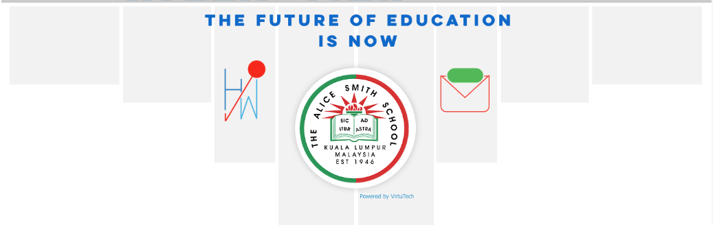
The general notion that I wanted to convey was that of grandeur and sophistication. When looking at where characteristics like these were present in school I found that they can predominantly be found in the form of banners. These banners are representative of awards and achievements and are displayed prominently in school so that they can show their prowess. Because of this I wanted to reflect a similar notion by incorporating the shape of the banner. This can be seen in the light gray boxes that increase in length and decrease in width as they reach middle in order to reach a finer point. This banner also has another effect of providing leading line that draw the visitors eyes down through the website to view more.
For images, I added in 3 of the icons that I had previously created for the augmented reality aspect of the film. I chose to add these 3 as they are neutral images that can be generalized and identifiable by several people. In order to keep the focus of the website on the Alice Smith School, I made the logo the largest on the page and centered it. On Wix i was able to add a small drop shadow and white border to the image, as this was able to stand out much clearer against the similarly colored background, now it appears as though it is a stamp. In order to incorporate the phrase I previously created for VirtuTech "The Future of Education is Now" I decided against adding the light blue banner and instead as the catchphrase act as a title on the website's homepage so that it could be a calling to students and parents to enroll in the school.
For images, I added in 3 of the icons that I had previously created for the augmented reality aspect of the film. I chose to add these 3 as they are neutral images that can be generalized and identifiable by several people. In order to keep the focus of the website on the Alice Smith School, I made the logo the largest on the page and centered it. On Wix i was able to add a small drop shadow and white border to the image, as this was able to stand out much clearer against the similarly colored background, now it appears as though it is a stamp. In order to incorporate the phrase I previously created for VirtuTech "The Future of Education is Now" I decided against adding the light blue banner and instead as the catchphrase act as a title on the website's homepage so that it could be a calling to students and parents to enroll in the school.
|
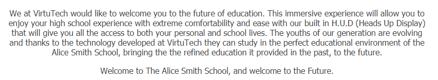
In accordance to the theme I chose, I created a short introductory paragraph to the school and the high school experience that VirtuTech is able to provide. I made sure to incorporate key factors that are present in the film such as the H.U.D as wells as how "perfect" of an educational environment the school is.
|
I designed the homepage of the website to fill the whole screen when you are at the top. This way, when you begin scrolling down you are taken away from the world of the short film to an area consisting of short film awards and a synopsis. These two parts are separated by a banner saying "A Short Film By Alastair Tupling":

I used a drop shadow below the banner in order to clearly define the end of the previous section and start of another.
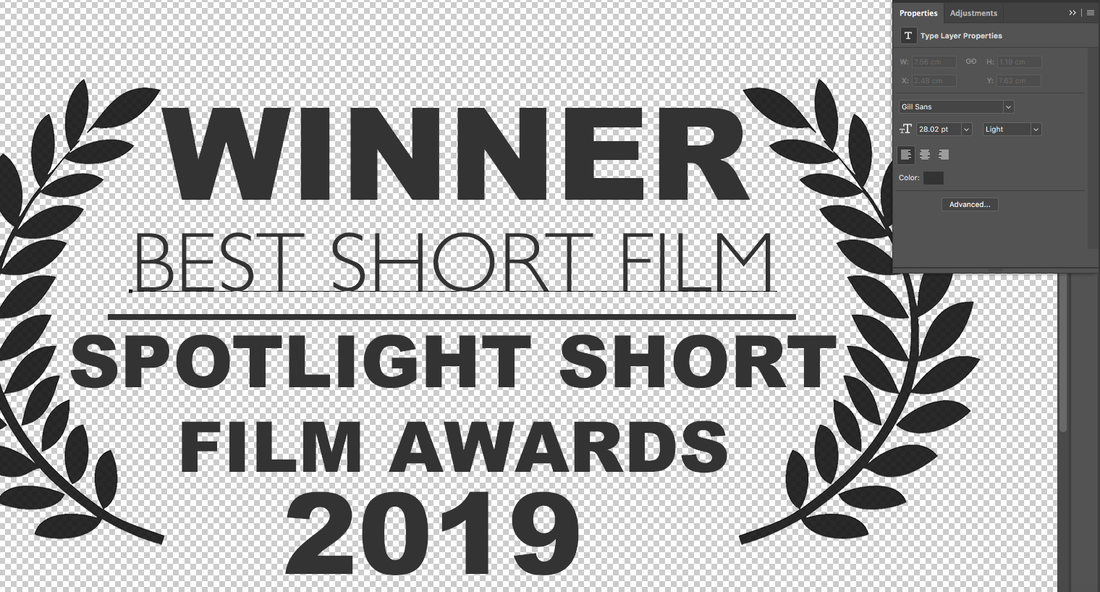
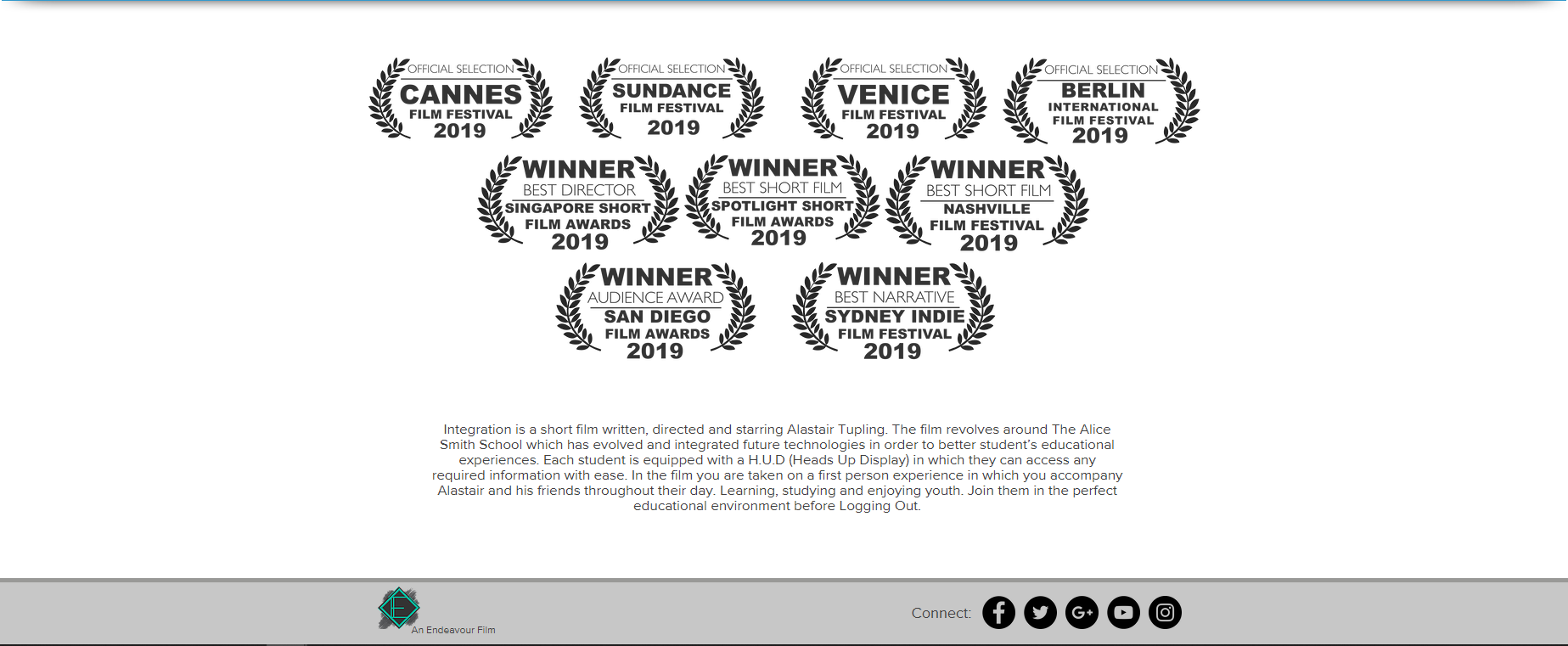
Short Film Awards
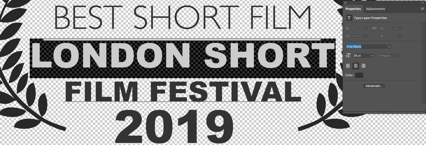
Using a template I was able to get the leaves that frame the text on either side. From this point onwards it was simply a matter of manipulating text in order to fit appropriately depending on the length of the festival's name and award. I created a total of 4 awards for "OFFICIAL SELECTION" as well as 6 "WINNER" awards which can be seen below as well as on the final website at the bottom of this page.


|
The following screenshots were taken after making a number of film awards, once I had found the most efficient way to make them.
Using an existing film award logo, I used the selection tool to copy the leaves on either side. I then recolored them a dark gray using the paint bucket tool. Once I finalized the layout I was able to easily replicate the design using the following process: |
|
I created a pair of logos:
1 being a Winner award and the other being and award for official selection in order to have a a variety of awards. I began by duplicating the group of logos. |

|

|
> I then selected the text tool in order to edit the layout I had previously made.
I made sure to use sans serif fonts in order to keep the logos as simple as possible and enforce the idea of officialism of the awards.
I used a combination 'Gill Sans' and Bold 'Arial Black' in order to create the logo. 'Gill Sans' is used for the details of what the award is as it is not the main focus of the logo. This font is also made slightly smaller in order to create further contrast between it and the "WINNER" title. Bold 'Arial Black' was used as it is able to stand out clearly in order to place more emphasis on the fact the the film is a "WINNER' of an award as well as where/when the award came from. |

|

|
Finally it was a simply matter of changing the name of both the award as well as the film festival it came from.
|
|
Footer
At the bottom of the website is a footer. This footer will consist of the Name / Logo of the production company as well as social media links for the film:

Production Company Logo
|
A slideshow showing the experiments I did when creating the logo. Some design are further mentioned.
|
I divided the creation of the production company (and accompanying logo) into 3 different aspects:
1 - Name I settled on the name Endeavour due to the sense of grandeur that accompanies the word as well as its meaning: "try hard to do or achieve something" which reflects a positive message of a production company wishing to push forward smaller developments in order them to attain success. 2 - Design (General Aesthetic) Overall, I wanted the logo to reflect the two sides of Endeavour. One being, an established group, whilst the other is creative and wishes to be new and unorthodox by aiding smaller developments. This lead to the use of an art Deco themed E with a modernized border in order to connect old refined roots of the company to future ideology. I also experimented with adding a brush mark behind the diamond in order to reflect the creative aspects of the company. |
3 - Design (Color)
I experimented with a variety of color combinations as well as how some worked with the brush mark. I found very quickly that using a dark gray background for the diamond is much more effective as it creates a greater contrast between the background and the areas of color, making the design clearer. At first I liked the use of dark red as it gave an overall darker theme to the logo, but decided that if I were to made the red brighter than this it would lose the refined yet creative design. I decided instead to use teal, as the color itself is relatively obscure and creates a nice contrast between it and the background, giving one of the clearest designs without being too overpowering like the orange / blue. Finally I left in the paint brush mark as it added another layer of intrigue to the design as without it, the design seemed rather bleak with the bright color.
I experimented with a variety of color combinations as well as how some worked with the brush mark. I found very quickly that using a dark gray background for the diamond is much more effective as it creates a greater contrast between the background and the areas of color, making the design clearer. At first I liked the use of dark red as it gave an overall darker theme to the logo, but decided that if I were to made the red brighter than this it would lose the refined yet creative design. I decided instead to use teal, as the color itself is relatively obscure and creates a nice contrast between it and the background, giving one of the clearest designs without being too overpowering like the orange / blue. Finally I left in the paint brush mark as it added another layer of intrigue to the design as without it, the design seemed rather bleak with the bright color.
FINAL LOGO DESIGN
Final Website
or use the following screenshots which were taken from the website:
Homepage

About Anchor:
This is found by scrolling down from the main page:
Integration Page
Cast Page
Contact Page