Creation of Animated Logos
I created several of the logos in a similar fashion by beginning with adobe illustrator before importing the files to adobe after effects where I animated them:
KLASS Logo
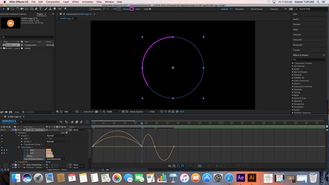
I began creating the logo in adobe illustrator due to its ability to manipulate line and drawn shapes much more effectively than any other program in the adobe suite. To do this I created two overlapping outlines of circles (shown by the pink and blue) as well as a fill that was orange. All these colors will later be changed, they are currently obscure in order to be able to identify them easier.


I then imported the adobe illustrator file directly into after effects. Due to adobe's connectivity it maintains all the layers I previously created and I can easily continue working with them. By selecting and right clicking the 3 items (the 2 circles + the fill) I can select "Create Shapes from Vector Layer". These new shapes can be manipulated in after effects. I then selected these to create a trim path which essentially is a setting that allows me to establish how far the start and end of the point is at any given time.


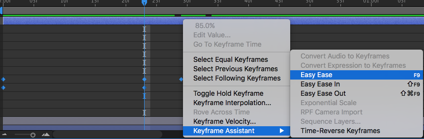
With what I previously said in mind, I created a trim path in which the line would complete a full loop, before bouncing back slightly at the top of the circle. This gives the animation a much more interesting movement in stead of simply moving from nothing to a finished position. Another way to increase the movement of the animated logo is to use the "Speed Graph"s which allow you to edit the speed at which the line move between key frames:
|
The fastest way to do this is to use the "Easy ease" tool which will automatically create a speed graph that is
fast > slow > fast This already creates more of an impact that the default speed. On the right you can see the speed graph showing the movement of the line. |
The final aspect of the animated KLASS logo is the fill. In order to do this I followed the same process as before, however before moving on with the speed graphs, I had to rotate the starting point of the circle as well as calculate how to have the circle pan downwards as the path by default fills in a circular motion. This took some time but eventually I discovered the correct locations for the start and end of the path. Next I edited the speed to be slightly more exaggerated version of the one created by the "easy ease" so that it would align with the speed of the circle as it slows to a close.
Finally, I changed the colors of each layer to red, green and white corresponding to the school's colors instead of the integration colors as this logo is specific to the school not the corporation behind the virtual experience.
Finally, I changed the colors of each layer to red, green and white corresponding to the school's colors instead of the integration colors as this logo is specific to the school not the corporation behind the virtual experience.
FINAL LOGO CAN BE SEEN IN THE SHORT FILM
Mail Logo and HW Logo
Below are 2 slideshows showing the part of the process of creating these logs. I used an identical process to that of the KLASS logo to create these:
One noticeable aspect that is different is that the 2 logos have extended paths which means that they journey they take is longer but more interesting. This is done through having the staring points for all lines be close together before using curves / arches to move in dynamic ways:
One noticeable aspect that is different is that the 2 logos have extended paths which means that they journey they take is longer but more interesting. This is done through having the staring points for all lines be close together before using curves / arches to move in dynamic ways:
|
|
This can clearly be seen in the mail logo in which all the lines start and move parallel to each other first and then diverge onto their corresponding path and finally meet their ends at the same time.
After the images in Illustrator, I simply followed the same process as before but made sure that the timings and speeds were appropriate. |
One aspect which was done differently within these logos was the notification for the number. In order to have this pop up I created 3 key frames for the circle to change size from 0% - 125% - 100% this difference in 25% means that when it appears it seems to pulse into appearance, instead of simply appearing it also makes the notification more noticeable and will attract the eye much more. In order to create a smoother transition I also added key frames for increasing the opacity, meaning that slightly before being full size is when the shape will be at 100% opacity, to the viewers eye the logo will grow smoothly from nothing rather than appearing and growing out of darkness.
FINAL LOGO CAN BE SEEN IN THE SHORT FILM
Future of Education Advert
This was an animation that I created with the intention of advertising the company that created the virtual reality experience. This phrase is one of their "catchphrases" and is heavily used both in texts as well as in tittles.
This logo was created using previously explained processes (the creation of the pop-up circle in the HW logo)
This logo was created using previously explained processes (the creation of the pop-up circle in the HW logo)
FINAL LOGO CAN BE SEEN IN THE SHORT FILM
Animated Intro - Loading Screen
Footage
In order to film my short film in the correct environment (at home) I cleared out a storage room which I could then covert into what looks like a small apartment as this storage room is connected directly to a small wet kitchen + washer / dryer.


Once this was done I was able to begin filming myself. I did this by setting up the camera in the correct location, then pressing record from whatever position I could get into that was close to my starting position. I would also make sure to leave a couple of second of a frozen start to a shot. This means that when i'm editing, i'm not having to edit footage of me rushing into place and then immediately start moving again. It allowed to have more space to edit with.
One of the issues I encountered with this method was that I had several shots that were out of focus as I had to rely solely on the auto focus of the camera which at times was very indecisive. However, even through this I was still able to get a series of good shots and only encountered a few times in which the auto focus ruined a piece of footage.
One of the issues I encountered with this method was that I had several shots that were out of focus as I had to rely solely on the auto focus of the camera which at times was very indecisive. However, even through this I was still able to get a series of good shots and only encountered a few times in which the auto focus ruined a piece of footage.
The next location was school, for this I filmed around on of my actors getting a haircut (Maddy Lankester). In order to hint at the fact that this world is virtual reality and not augmented I wanted to implement an unsuspected and unspoken change. This change would be in the attire of Maddy Lankester and Kai Robinson as well as the change in her hair. To emphasize this slightly I filmed the final few scenes of the film before the hair cut, and the rest afterwards.
In order to film at school, I followed what I initially set out to do which was use the GoPro Hero 5. I had very few problems but one of them is quite noticeable in certain scenes, the camera when I was walking could be very shaky or wouldn't be horizontal and instead at a slight angle. Furthermore, the mount for the GoPro was placed on my forehead, I attempted to have it as low as possible but was unable to fully show a first person view, as when I looked down I should've been able to see my feet / legs / arms / hands and part of my chest but instead I could barely see my feet. This continued and affected several shots.
However, one advantage to the GoPro over the other camera I had available is the battery life. Because of its increased battery life I was able to leave the camera recording for extended periods of time (although it may seem like less footage that before there is still a lot within each clip).
Once I had all the footage I went through it in order to pic out the best takes for each scene before taking these forward into i-movie where I will edit them. Thanks to i-movie's easy to use interface and simplicity in regards to its capabilities, I was able to edit it fairly quickly with little trouble, however I did have to export parts of clips to take them into adobe effects where I can add the animated aspects of the film. I was only able to take short clips of a few seconds as it takes a long time to motion track as after effect with track the footage frame by frame in order to determine the surfaces available:
|
|
The process for adding in the animated logos is short in steps but is time consuming.
After using the "camera tracker" option on after effects you will see a series of colored dots. If you hover your cursor between the points it will shade an area that corresponds with its face. Once you have found a triangle that is suitable, right click and select "Create Solid and Camera" to create a shape on that face for each animated logo (4) Once these layers were created, it was simply a matter of importing the previous adobe after effects files into this one and adding them onto that layer. The next part which take much trial and error is when lining up the different logos together as well as ensuring that they stay in the correct place during the scene, even when the camera moves. I then repeated the same process for the "Future of Education" logo. However, it was slightly more challenging a I did not have a surface that was easily tracked which meant I had to find the closest option and then move the logo using the axis to the best place possible. |


Once this footage was edited in after effects it could be taken back into i-movie where it underwent color correction along with all other shots in school. I wanted to emphasize the "falseness" of the school as well as display the exaggerations of how "perfect" our school is.
|
The first image is that of the time line, it is showing the corridor scene which is currently split into 3 parts because the animated aspect is the brief moment in which all of us go to our lockers. As a student it is ignored however for a 3rd party it will be unnoticeable.
In regards to color correction I increased the white balance to make all the whites stand out more and make it brighter but more importantly I increased the saturation slightly as well, this gave the shots both a bright and unrealistically perfect sight. |
  |
|
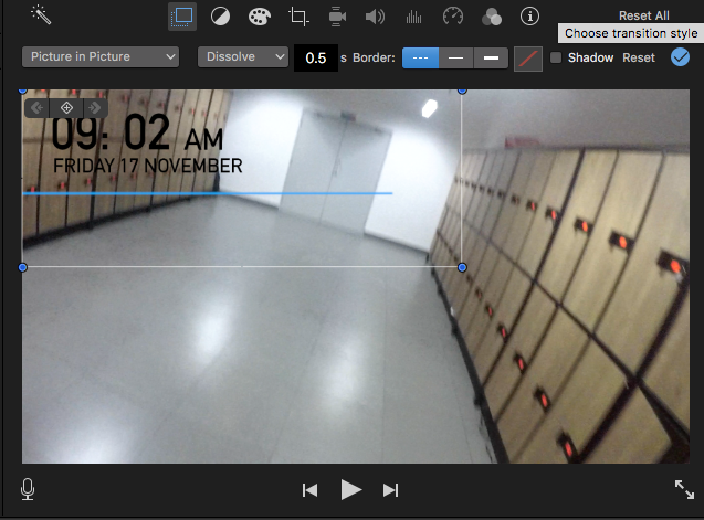
The final aspect of the H.U.D which I added was the time and date, this is by far the most important piece of information you can know, because of this I decided that it should be an integral part of the H.U.D.
To create the time stamp I used Photoshop. I created a text piece using the font Tahoma of varying size. I created this clock by drawing a light blue line and increasing the feather slightly as well as decreasing the brightness. This setting always for the clock to be visible without the jacket standing out too much. If I were to do this aspect again, would've expected you to go somewhere or been taken by your parents. |
Finally I added very simple credits using the "Titles" option on i-movie. I selected two different types of titles which were both modern and clean. These 2 titles also had variations that were lower. In order to maintain an emphasis on the title "Integration" there is no other piece of information that rivals it for the center of the screen, instead the gaze is brought downwards where all the names for actors were presented.
