|
The first decision i made for the creation of my double page on adobe indesign was to theme the page after the contents of the page. In this case it was to theme it after the film I had created in which it is centered around a school's newspaper club. My main idea was to have the text themed like a slightly unconventional black and white 1900's newspaper, this would be done through the use of serif text as well as hard lines to clearly divide the page. TitleI began by creating a title themed like the front page of this newspaper. I divide the title section into 3 rows: The title of the article: "The Watchers" which is the name of the show, this is to be the largest item on the page but as is it themed after a newspaper, it must not overpower the page as newspapers are known for being packed with text. Genres: I inputted the genres of the film in a style similar to how newspapers would have their strapline; Clear and framed. In order to do this, I put white text within a black box to create a contrast and make the white stand out. The words used the same font and were all caps like the title in order to establish a connection between the two. Dates: Finally as a way of representing the date of the magazine, i replaced it with the release date of the film alongside a phrase to create intrigue in the film by saying they "must" watch it. I established the Genres and Dates rows, but experimented with different serif fonts for the title:
Page NumbersDue to the double page being created like a newspaper, i must ensure that my magazine doesn't lose its identity by looking like a newspaper, the page numbers are a way to do this. My page number may be colored and must stand out against the rest of the page. To do this i created a bar across the bottom with page numbers at either end which used the same colors as the ones used on the contents page:  LayoutAfter looking at different magazines I established two different layout which i could use: 1 - Double page image with small section of text on one page - This would require a high quality image and text that stands out against the background image. 2 - Full page of text on one page, Image on other page - The text would need to be laid out correctly so that the page doesn't seem over crowded.
These two screenshots are examples of option 1. I decided to use photo of school lockers as it is to do with the plot of the film and it is symbolic. I tried to use a white text in order to help the text stand out more against the image, however similarly to the black it would get easily lost. The same problem occurred with the title. However, i did like the images used. The first image has a good focus and puts an emphasis on the lock and draws the readers' eyes, it is also blurred in the background which aids in allowing us to read the text however it is not enough. The second image has is split down the middle with the lockers taking up one one half and the building taking up the other, this was a good effect and the white font was easier to see on the lockers however, the left half on the page had no purpose and was very bland which resulted in quite a boring and uninteresting page.  This screenshot was taking during the process of inputting and laying out text. I took another set of images and chose to put more emphasis on the lock (like in the previous drafts), this photo has both the symbolism of the secrets being kept within this locker as well as a harsh light in the background which is symbolic of the potential life or death situations the students undergo. In order to add an aspect of the magazine to this double page, is made the hard lines blue, this ensured that the identity of the magazine isn't lost in these pages. I kept the same text used in the previous drafts as it was suitable and fit well, however needed to add more to fill the page. To do this, I created small sections using hard lines to separate them and creating a "Teaser" box and a short "character bio", both of these were included in order to give the readers farther insight to the film after reading the introduction. This layout worked well, as it was compact yet not over crowded however, the next piece of text i needed to add was the interview which i referenced in my contents page. This would not fit in this layout. So i moved around and rearranged the pieces of text i already had and created this layout:  I continued using the colors scheme from my magazine to highlight names and when creating the hard lines to divide the page in two. I believe that this layout is very efficient as it is very clear and defined and flows well from top to bottom. My issue however, is the aim of this page was to resemble and relate to the film itself but by changing the colors to the magazine's color scheme it loses this effect. On top of this, it doesn't work well with the title and if the title is changed to match this, i would almost completely lose the effect of being an old and refined newspaper.
0 Comments
For my final double page spread I changed all the colored lines and text back to black in order to retain the old newspaper style, and this is the final product i created: 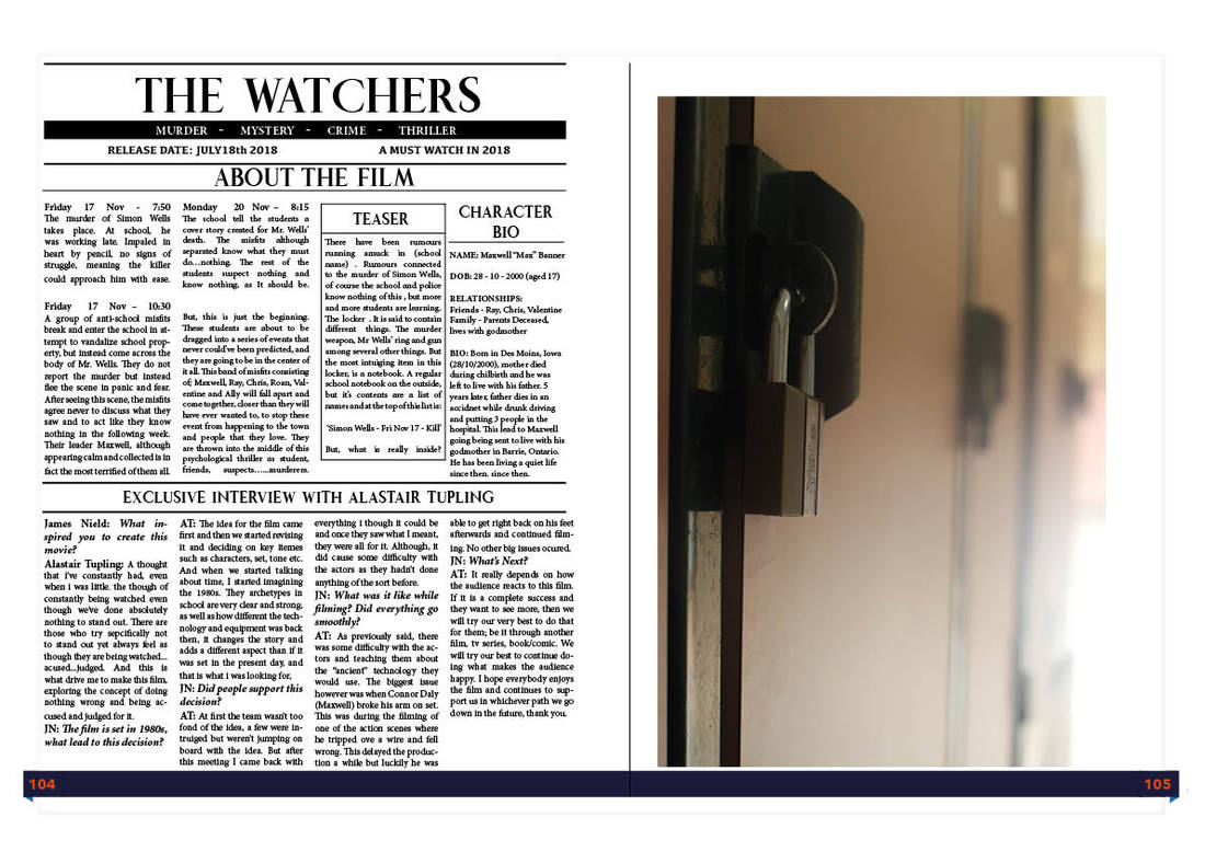 |


